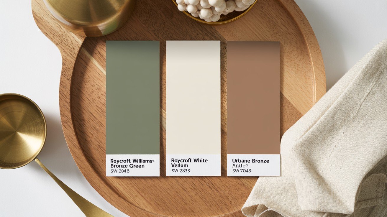
Choosing the right paint color can make or break your space. SW Roycroft Bronze Green offers the perfect blend of warmth and refinement you’re looking for.
But here’s the thing, dark colors can be tricky.
Will it work in your room? What colors pair well with it? How does it compare to similar shades?
I’ve spent years helping homeowners navigate these exact questions. This guide solves your SW Roycroft Bronze Green dilemmas.
You’ll learn:
- What makes this color special and where to use it
- Perfect color combinations with specific paint codes
- Real comparisons with similar greens
- Expert styling tips from actual design experience
No fluff. No sales pitch. Just honest advice from someone who’s seen this color change countless spaces.
Ready to make the right choice? Let’s start.
What is SW Roycroft Bronze Green?
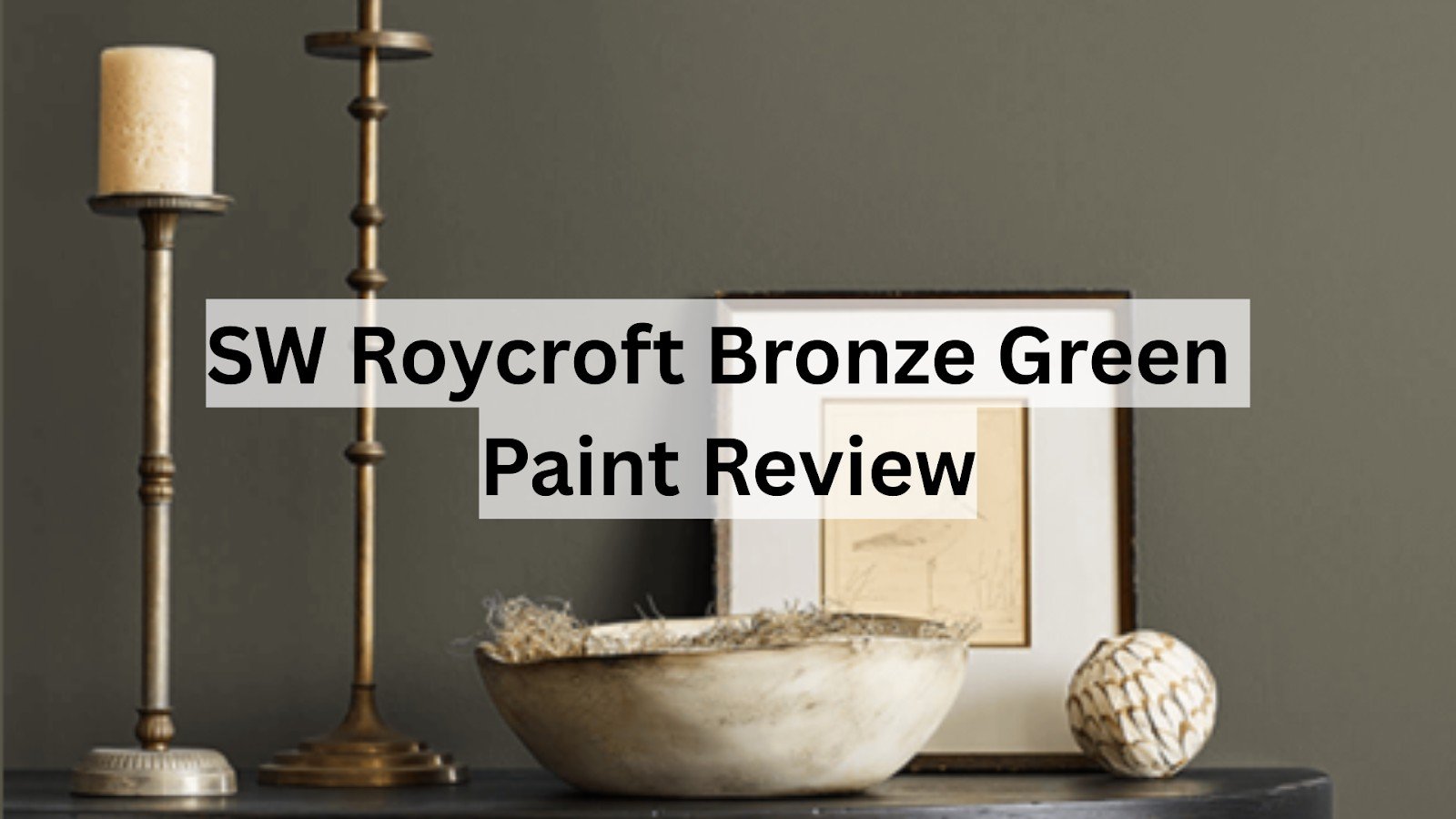
SW Roycroft Bronze Green (SW 2846) is a deep, earthy green with bronze undertones from Sherwin-Williams’ Historic Color Collection.
Named after the Arts and Crafts movement leader Elbert Hubbard’s Roycroft community, this color captures the essence of handcrafted authenticity.
Here’s what makes it special:
- LRV (Light Reflectance Value): 9 – This means it’s quite dark
- Undertones: Warm bronze and brown notes
- Finish options: Available in all Sherwin-Williams sheens
- Color family: Green with neutral leanings
The color shifts beautifully throughout the day. In the morning light, you’ll see more of the green. Evening light brings out those gorgeous bronze undertones.
Color Psychology and Mood
Colors affect how we feel. SW Roycroft Bronze Green creates a sense of:
- Grounding and stability: The earthy tones make spaces feel secure
- Refinement: It’s polished without being flashy
- Warmth: Bronze undertones prevent it from feeling cold
- Connection to nature: Reminds us of forest floors and aged copper
This isn’t a color that screams for attention. Instead, it whispers confidence and timeless style. Perfect for creating spaces where you want to feel both relaxed and inspired.
Where to Use SW Roycroft Bronze Green
A. Interior Design Ideas
Living Rooms
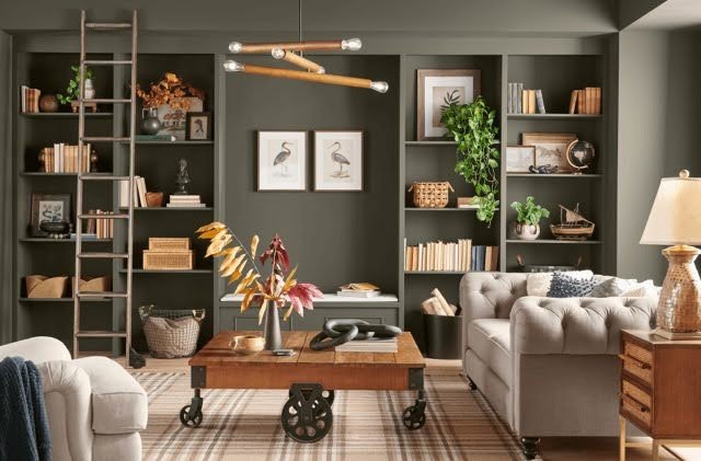
- Accent walls behind sofas or fireplaces
- Built-in bookcases and cabinetry
- Pair with warm wood tones and brass fixtures
Bedrooms
- Creates a cozy, cocoon-like atmosphere
- Works beautifully as a headboard wall
- Combines well with crisp white bedding
Dining Rooms
- Formal yet inviting
- Enhances candlelight and dinner parties
- Pairs with rich wood furniture
Home Offices
- Promotes focus and concentration
- Less distracting than brighter colors
- Creates a professional backdrop for video calls
Kitchens
- Beautiful on lower cabinets
- Island color for contrast
- Complements both modern and traditional styles
Pro tip: Use it in rooms with good natural light to prevent it from feeling too dark.
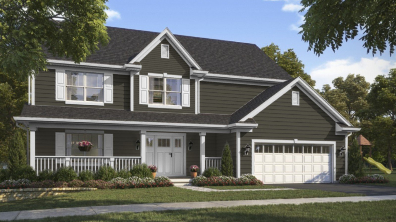
B. Exterior Applications
Front Doors
- Makes a refined first impression
- Pairs beautifully with brick or stone
- Complements both warm and cool exterior colors
Shutters and Trim
- Adds depth and character
- Works with white, cream, or gray siding
- Creates a cohesive, polished look
Accent Features
- Garden gates and fencing
- Outdoor furniture
- Planters and garden accessories
Best Coordinating Colors
Creating the perfect color palette? Here are my top picks that work beautifully with SW Roycroft Bronze Green:
Complementary Sherwin-Williams Colors
|
Color Name |
Color Code |
Description |
Best Use |
|
Roycroft Vellum |
SW 2833 |
Warm, creamy white with subtle yellow undertones |
Trim and ceilings |
|
Antique White |
SW 6119 |
Clean, crisp white with slight gray undertones |
Modern farmhouse looks |
|
Urbane Bronze |
SW 7048 |
Deep, rich brown with green undertones |
Front doors and accents |
Color Scheme Ideas
Monochromatic Approach:
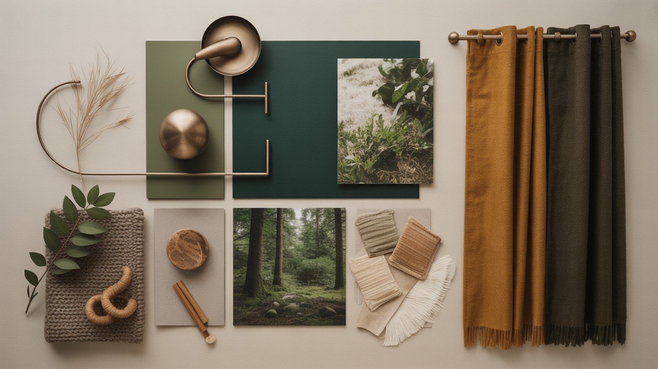
- Use different shades of green and bronze
- Add texture through fabrics and materials
- Creates a calm, unified feeling
Complementary Contrast:
- Pair with warm whites and creams
- Add brass or copper accents
- Include natural wood elements
Triadic Harmony:
- Combine with deep blues and warm oranges
- Use as accent colors in small doses
- Creates dynamic but balanced spaces
SW Roycroft Bronze Green vs Similar Colors
Let’s compare this color to other popular options:
|
Color Name |
Brand |
Key Characteristics |
Best For |
Comparison to SW Roycroft Bronze Green |
|
SW Billiard Green |
Sherwin-Williams |
Cooler, more true green |
Traditional spaces |
Roycroft is warmer with more bronze undertones |
|
Vintage Vogue |
Benjamin Moore |
Lighter, more gray undertones |
Subtle color schemes |
Roycroft is deeper and richer |
|
Green Smoke |
Farrow & Ball |
Slightly more blue undertones |
Premium applications |
Roycroft offers better value with similar depth |
The key difference? SW Roycroft Bronze Green has those distinctive bronze undertones that make it feel warmer and more inviting than most dark greens.
Expert Tips on Pairing and Styling
Lighting Matters Test this color in different lighting conditions before making your final decision. Use warm LED bulbs to enhance the bronze tones and bring out the color’s best qualities. Consider how much natural light your room gets throughout the day, as this will affect how the color appears.
Texture is Your Friend Add woven baskets and natural fibers to create visual interest and warmth. Include leather furniture and metal accents to complement the bronze undertones. Mix matte and glossy finishes throughout the room to add depth and prevent the space from looking flat.
Don’t Forget the Ceiling Paint your ceiling a lighter shade from the same color family to maintain cohesion. You can also go with a warm white like Roycroft Vellum for contrast. This approach prevents the room from feeling too enclosed while maintaining the rich atmosphere.
Scale Appropriately Use SW Roycroft Bronze Green on one accent wall in smaller rooms to avoid overwhelming the space. Paint all four walls in larger rooms where the color can breathe and make a statement. Always consider your room’s proportions when deciding how much of this dark color to use.
Balance is Key Mix in lighter colors through your furniture and decor choices to create visual relief. Add metallic accents in brass or copper that complement the bronze undertones. Include plenty of natural elements like wood and plants to soften the dramatic color and create a welcoming atmosphere.
Conclusion
SW Roycroft Bronze Green isn’t just another trendy color. It’s a timeless choice that brings warmth, refinement, and character to any space.
This color works because of its bronze undertones. They prevent it from feeling cold like other dark greens. If you’re painting an accent wall or changing your entire home’s exterior, this shade delivers depth and style that never goes out of style.
Ready to move forward?
Start with a sample. Paint a large swatch on your wall and live with it for a week. See how it changes throughout the day. Watch how different lighting affects its appearance.
The key is testing first. Don’t rush the decision. Once you experience how SW Roycroft Bronze Green changes your space, you’ll understand why design professionals choose it again and again.
Frequently Asked Questions
Does SW Roycroft Bronze Green look black in low light?
No, it maintains its green character even in dim lighting. The bronze undertones keep it warm and prevent it from appearing flat or black.
What’s the difference between this and regular forest green?
SW Roycroft Bronze Green has warm bronze undertones that regular forest greens lack. This makes it feel more refined and less harsh than typical dark greens.
Can I use this color in a bathroom?
Yes, it works beautifully in bathrooms with good ventilation. Use semi-gloss or satin finish for easy cleaning and moisture resistance.
How many coats do I need for full coverage?
Most surfaces need two coats for complete coverage. Prime first if you’re going over a lighter color or different paint type.
Does this color work with stainless steel appliances?
Yes! The bronze undertones complement stainless steel perfectly. It’s actually one of the best dark colors for modern kitchens with steel appliances

