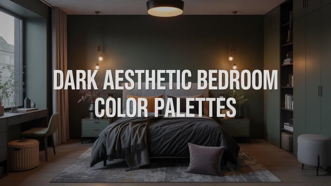
Dark bedrooms are having a major moment. And for good reason.
They feel cozy. Sophisticated. Like a personal retreat from the world.
But here’s the thing: not all dark color combinations work. Some make rooms feel cramped. Others just look flat.
I’ve tested dozens of palettes in real bedrooms. Big ones. Small ones. Modern spaces and vintage rooms.
The result is 35 color combinations that deliver on their promise.
These aren’t just pretty pictures. They’re practical palettes you can use in your own space. Each one balances mood with livability.
What makes these palettes different is simple. They follow proven color theory principles. They work with natural light. And they’ve been tested in actual homes, not design studios.
You’ll find combinations for every style and room size. From bold jewel tones to soft neutrals that work beautifully in small spaces.
Why Color Palettes Matter in a Dark Aesthetic Bedroom
Color palettes are the foundation of any successful dark bedroom design.
The magic happens in three key areas:
- First, contrast creates visual interest. Without it, dark rooms feel flat and one-dimensional. You need light and medium tones to make dark colors pop.
- Second, depth prevents that “cave” feeling. Layer different shades of your base color. Add texture through fabrics and finishes.
- Third, lighting compatibility ensures your palette works day and night. Dark colors absorb light differently from bright ones.
Your palette needs three types of colors:
- Base tones
- Accent colors
- Highlight shades
This formula keeps moody rooms from feeling oppressive while maintaining that coveted dark vibe.
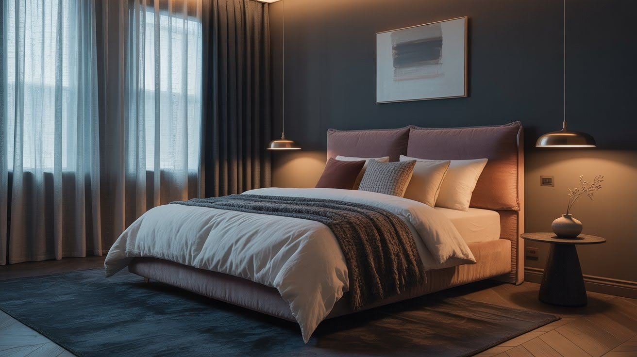
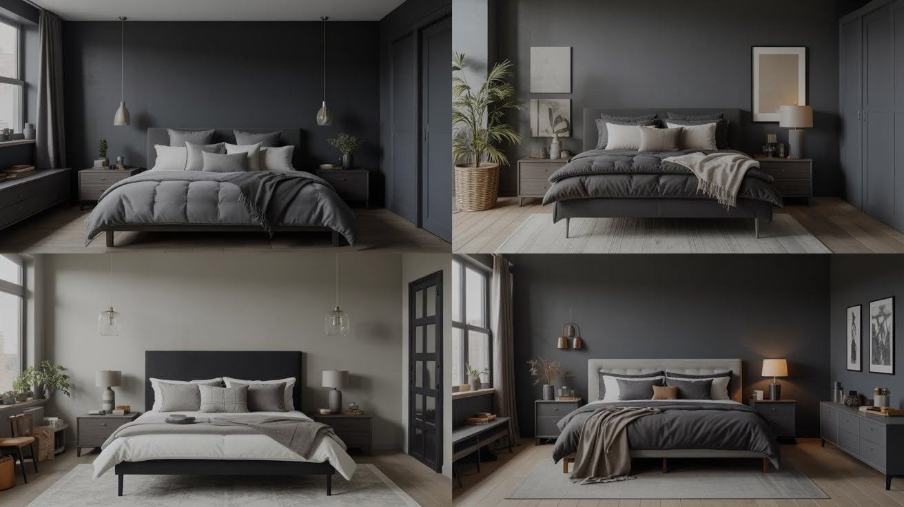
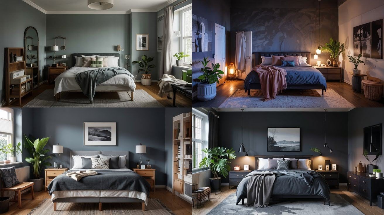
Timeless Black & Gray Combos
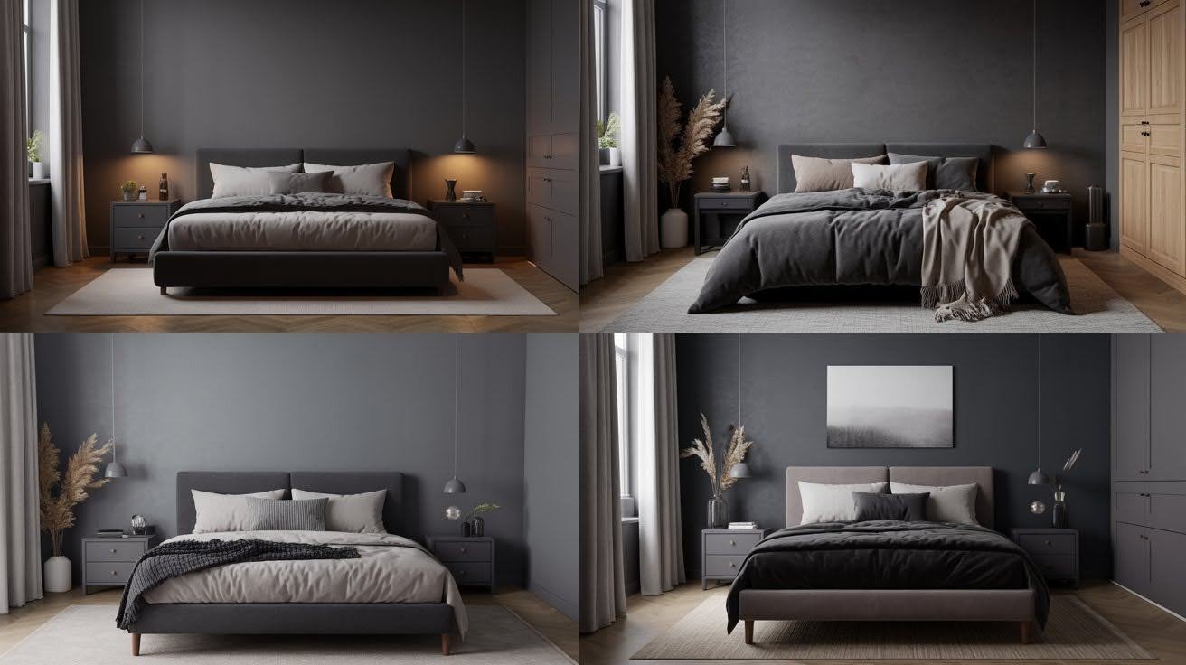
- Matte Black + Cool Gray + Warm White: This classic trio never fails. Matte black walls create depth without glare. Cool gray adds sophistication. Warm white prevents harshness.
- Charcoal + Pewter + Ivory: Softer than pure black, charcoal feels approachable. Pewter brings metallic warmth. Ivory adds just enough lightness.
- Ash Gray + Jet Black + Pale Silver: Perfect for modern spaces. Ash gray dominates without overwhelming. Jet black creates drama. Pale silver adds subtle shine.
- Onyx + Cloud Gray + Soft Taupe: Rich onyx makes a bold statement. Cloud gray softens the intensity. Soft taupe warms up the entire palette.
Warm Earthy Tones with Depth
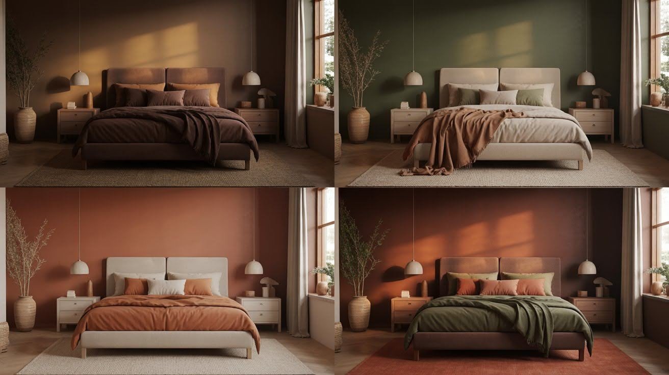
- Espresso Brown + Burnt Sienna + Beige: Coffee lovers, this one’s for you. Espresso creates a cocoon-like warmth. Burnt sienna adds richness. Beige keeps things balanced.
- Forest Green + Clay Brown + Bone White: Nature-inspired and grounding. Forest green feels fresh yet dark. Clay brown adds earthiness. Bone White provides clean contrast.
- Terracotta + Mocha + Warm Sand: Southwestern vibes with modern appeal. Terracotta brings personality. Mocha adds depth. Warm sand lightens the mood.
- Rust + Olive + Driftwood: Autumn colors that work year-round. Rust adds warmth without being overwhelming. Olive provides subtle sophistication. Driftwood keeps things natural.
Moody Jewel Tones
- Deep Emerald + Black + Brass: Luxury meets drama. Deep emerald creates richness. Black adds intensity. Brass accents bring warmth and shine.
- Sapphire Blue + Graphite + White Marble: Regal and refined. Sapphire blue feels both bold and calming. Graphite grounds the palette. White marble adds sophistication.
- Plum + Ink Black + Ivory: Mysterious and romantic. Plum creates depth without feeling heavy. Ink black adds drama. Ivory provides necessary lightness.
- Ruby Red + Charcoal + Blush: Passionate yet balanced. Ruby red makes a statement. Charcoal tones it down. Blush adds unexpected softness.
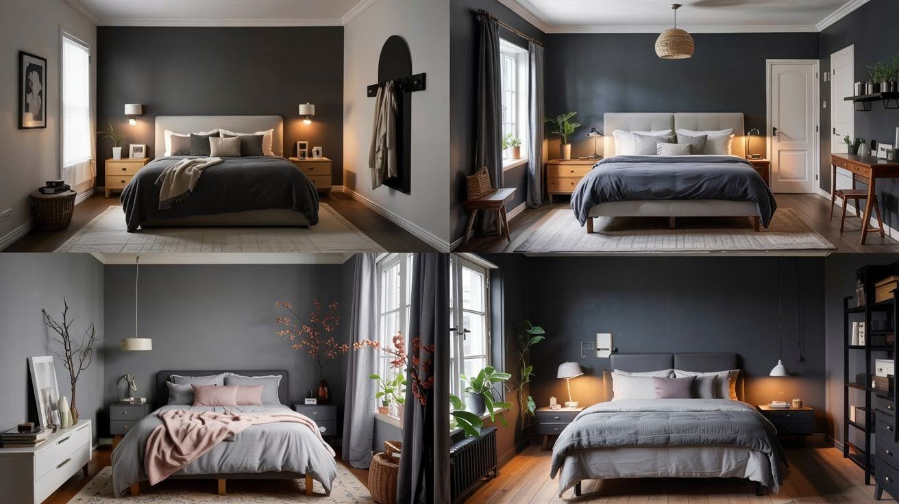
Soft & Subtle Dark Aesthetic
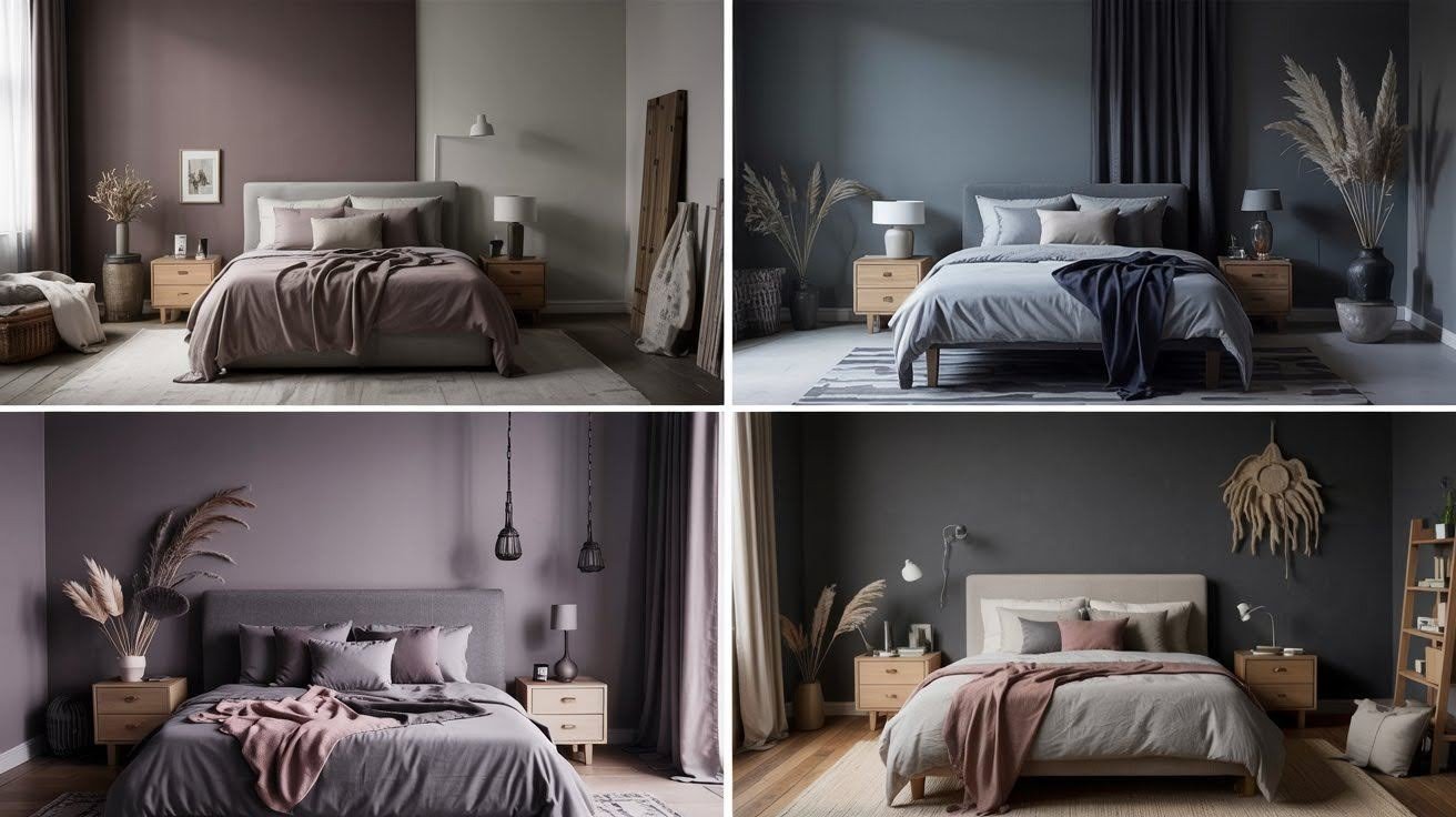
- Dusty Mauve + Mocha + Pale Gray: Gentle and sophisticated. Dusty mauve feels modern and calming. Mocha adds warmth. Pale gray provides balance.
- Stormy Blue + Cream + Midnight: Moody without being overwhelming. Stormy blue creates an atmosphere. Cream adds warmth. Midnight provides depth.
- Smoky Lavender + Slate + Linen: Unexpected and soothing. Smoky lavender feels fresh. Slate adds structure. Linen brings a natural texture.
- Warm Charcoal + Light Taupe + Dust: Understated and cozy. Warm charcoal feels inviting. Light taupe adds softness. Dust provides a subtle contrast.
Luxurious Modern Palettes
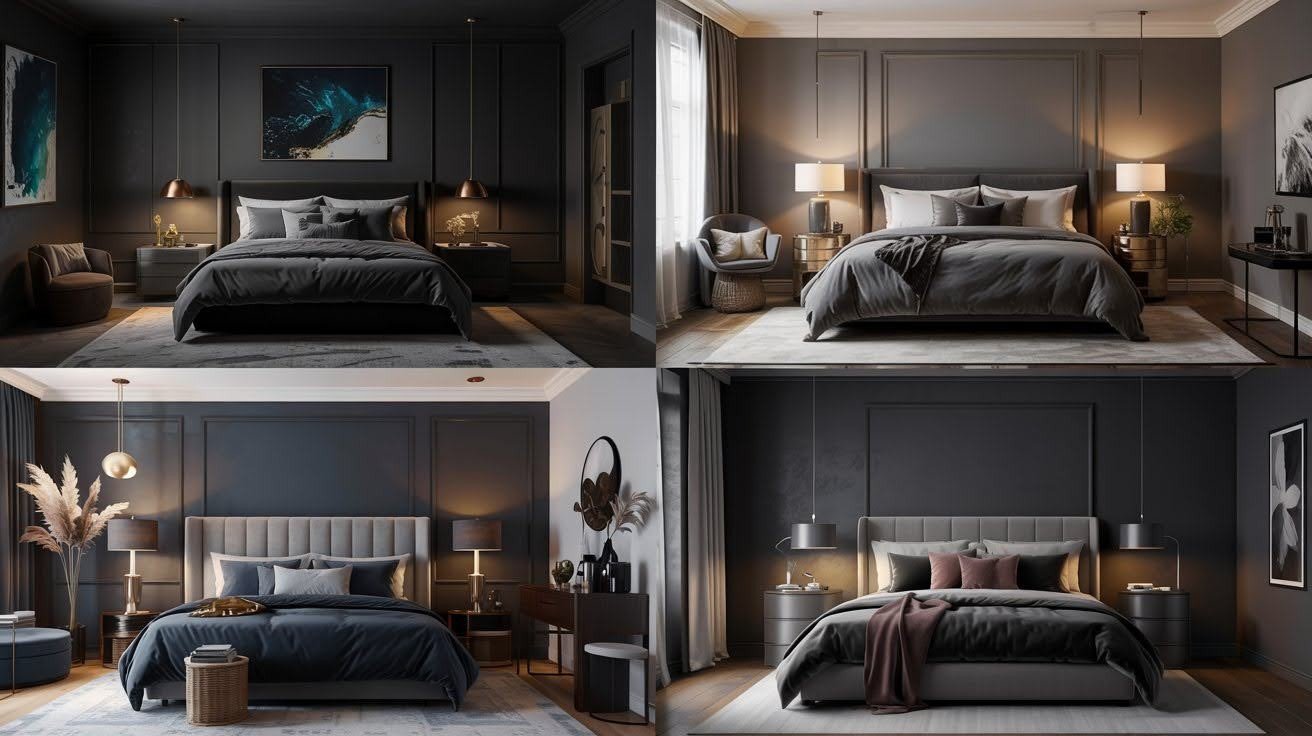
- Black + Gold + Deep Teal: High-end hotel vibes. Black creates drama. Gold adds glamour. Deep teal provides unexpected richness.
- Graphite + Rose Gold + Off-White: Contemporary and warm. Graphite feels modern. Rose gold adds femininity. Off-white keeps things fresh.
- Navy + Bronze + Greige: Timeless and sophisticated. Navy feels classic. Bronze adds warmth. Greige provides a perfect balance.
- Charcoal + Silver + Mauve: Cool and calming. Charcoal creates depth. Silver adds modern shine. Mauve brings a subtle color.
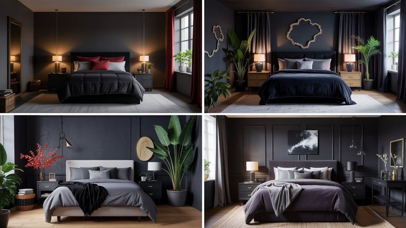
Minimalist Dark Neutrals
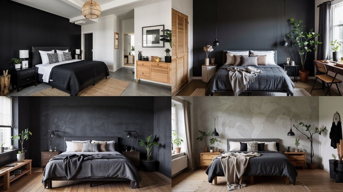
- Black + White + Natural Wood: Clean and striking. Black provides drama. White adds contrast. Natural wood brings warmth and texture.
- Deep Gray + Beige + Matte Black: Balanced and calm. Deep gray dominates gently. Beige adds warmth. Matte black provides accent points.
- Ash + Cream + Iron: Industrial meets cozy. Ash creates atmosphere. Cream adds softness. Iron brings a modern edge.
- Taupe + Black + Linen: Soft and sophisticated. Taupe feels gentle. Black adds drama. Linen provides a natural texture.
Nature-Inspired Mood
- Slate + Moss Green + Ivory: Organic and calming. Slate mimics natural stone. Moss green adds life. Ivory provides a clean contrast.
- Midnight Blue + Stone + Dusty Rose: Unexpected and beautiful. Midnight blue creates depth. Stone adds earthiness. Dusty roses bring warmth.
- Cinder Gray + Fern + Birch: Fresh and natural. Cinder gray feels grounded. Fern adds color without brightness. Birch brings lightness.
- Charcoal + Copper + Sky Gray: Industrial meets nature. Charcoal creates a base. Copper adds warmth. Sky gray provides balance.
Bold & Dramatic Pairings
- Jet Black + Scarlet + Smoky White: High drama that works. Jet black creates intensity. Scarlet adds passion. Smoky white prevents harshness.
- Obsidian + Indigo + Gold Leaf: Mysterious and luxurious. Obsidian provides depth. Indigo adds richness. Gold leaf brings glamour.
- Raven Gray + Emerald + Chalk: Bold yet balanced. Raven Gray creates a foundation. Emerald adds life. Chalk provides contrast.
- Noir + Deep Violet + Porcelain: Dramatic and sophisticated. Noir creates mystery. Deep violet adds richness. Porcelain brings refinement.
Small Space-Friendly Combos
- Soft Charcoal + Vanilla Cream + Warm Beige: Perfect for cozy rooms. Soft charcoal won’t overwhelm. Vanilla cream adds light. Warm beige provides balance.
- Dusty Navy + Milk White + Oak: Opens up tight spaces. Dusty navy feels spacious. Milk white reflects light. Oak adds natural warmth.
- Cloudy Gray + Pale Blush + Espresso: Gentle and inviting. Cloudy gray creates calm. Pale blush adds softness. Espresso provides grounding.
Tips for Using These Palettes in a Real Bedroom
- Test paint colors in different lighting conditions before committing
- Use the 60-30-10 rule: 60% base color, 30% accent, 10% highlight
- Apply your darkest color to the focal wall, not all four walls
- Choose matte finishes for walls to reduce glare
- Add texture through fabrics, rugs, and wall treatments
- Use metallic accents to reflect light and add interest
- Layer different shades of your base color for depth
- Consider removable wallpaper for renters
- Start with accessories before painting the walls
- Use natural light to your advantage with sheer curtains
Conclusion
Dark bedrooms don’t have to be difficult or risky.
The right color palette makes all the difference. It creates a mood without sacrificing comfort. Drama without feeling oppressive.
I’ve shared 35 combinations that work in real homes. Each one balances light and dark. Warm and cool. Bold and subtle.
Start with one palette that speaks to you. Test it with samples. Add layers gradually.
Your bedroom should feel like a personal retreat. A place where you can truly relax and recharge.
These palettes will help you create exactly that. A space that’s both stylish and livable. Dark and inviting.
The perfect combination for better sleep and better style.
Frequently Asked Questions
Will dark colors make my bedroom feel smaller?
Not if you use the right palette. Include light accent colors and use strategic lighting. Dark colors can make rooms feel more intimate and cozy rather than cramped.
How do I prevent a dark bedroom from feeling depressing?
Balance is key. Use warm undertones, add texture, and include lighter colors in your palette. Natural light and layered artificial lighting also help maintain a positive mood.
What’s the best way to test these color combinations?
Buy sample paints and test them on large poster boards. Move the boards around your room throughout the day to see how colors look in different lighting conditions.
Can I use these palettes in a bedroom with little natural light?
Yes, but focus on the lighter colors in your chosen palette. Use mirrors to reflect available light and invest in good artificial lighting. Avoid the darkest combinations if natural light is very limited.
How do I incorporate these colors without painting walls?
Use bedding, curtains, rugs, and artwork to introduce your palette. Paint an accent wall or use removable wallpaper. Add colored lighting or decorative accessories to test the combination first.


